
The importance of collecting and visualising data in the philanthropy sector

In the context of furthering philanthropy, the time for data is now! In the era of big data, the road to making strategic decisions in philanthropy could be laid by relevant and consistent data that is visualised in a comprehensive manner. Such consistent and comprehensive data around philanthropic efforts can inform action, support impact, drive advocacy and help maintain the linkages between the three.
The need to collect consistent data around philanthropic efforts:
The philanthropy sector plays a critical role in supporting local initiatives that aim to address social, economic, and environmental challenges across communities. From improving access to healthcare and education to promoting human rights and environmental sustainability, philanthropic organisations support a wide range of interventions aimed at enhancing the well-being of individuals and communities. However, there is limited and inconsistent data around such philanthropic giving, both globally and at a national level.
Collecting consistent and reliable data around philanthropic efforts is essential for improving transparency and accountability, guiding resource allocation, identifying trends and patterns, and ultimately, for achieving greater impact in addressing social, economic, and environmental challenges across countries.
Data for better decisions: Data around distribution of philanthropic giving has the potential to drive action as it enables philanthropic organisations to make better decisions around: What are the needs of today? How can we best respond to these needs?
Collecting data around the distribution of philanthropic giving across different regions and beneficiary groups can help philanthropic organisations identify areas with high levels of poverty, inequality, or environmental degradation and target interventions more effectively. Similarly, by collecting data on the distribution of funding across different program areas, organisations can identify areas where there may be gaps or underfunding and allocate resources more efficiently.
Data for greater impact: Data around the activities and outputs of philanthropic efforts have immense potential to inform impact as it enables philanthropic organisations to effectively assess: What were the outcomes of the intervention? How much did it matter?
Collecting data around the delivery of philanthropic activities can help stakeholders in the sector understand whether investments are making a positive impact and achieving the intended outcomes. Additionally, such data, when collected consistently, over a period of time, can help track progress, demonstrate effectiveness, and evaluate impact. To further evaluate the impact of philanthropic activities it is crucial to collect data around the key indicators relevant to the program area. For example, while evaluating the impact of a mental health support service in a country; it would be pertinent to learn key national indicators around mental health and well-being. Assessing data around such key indicators in line with what the funder set out to achieve and how the program advanced that goal, will help build a comprehensive understanding around the impact made.
The potential of visual mapping to present data around philanthropic efforts
Consistent, reliable data around philanthropic efforts, when visualised effectively can help to communicate the impact of philanthropic activities to stakeholders and further promote transparency and accountability in the sector. Presenting data in a comprehensive and accessible way can help demonstrate the human impact of philanthropy and build trust, empathy, and support for philanthropic activities. Efforts to visually present philanthropic data can go a long way in advancing advocacy efforts, improving social learning, and fostering collaboration and partnerships.
Data for advocacy and social learning: Visualising data around philanthropic activities and funding can help define the landscape of philanthropy at the national level, which can be used to advocate for policy changes that support philanthropic giving. This includes advocating for policies that support effective philanthropic investments and promote greater transparency and accountability in the philanthropy sector. Further, collective efforts around building databases and interactive tools could help develop best practices, advance knowledge sharing, and promote social learning.
Data for networking and collaboration: Visualising data on philanthropic giving can lead to organisations identifying potential partners that are working on similar causes or in the same geographic region. Further, collecting and visualising philanthropic data at a national level presents avenues for interactions, networking, and collaboration. New knowledge could be built as an outcome of interaction between stakeholders. Thus resulting in the development of shared understanding, comprehensive tools and common frameworks for impact evaluation.
Visual mapping can be a powerful tool to communicate the impact of interventions, demonstrate the distribution of resources, and highlight areas of need. Examples of visual mapping exercises are highlighted below:
- Geographic Mapping can be used to visualise the distribution of philanthropic activities geographically i.e., present geographic locations of philanthropic investments or the distribution of beneficiaries across different regions
- Impact Mapping can be adopted to visualise the impact of philanthropic interventions i.e., present changes in key indicators such as poverty rates, educational attainment, or health outcomes before and after a philanthropic intervention
- Funding Mapping can be used to visualise the distribution of philanthropic funding across different program areas or interventions i.e., present the proportion of funding allocated to different program areas to show changes in funding levels over time
- Network Mapping can be adopted to visualise the relationships between philanthropic organisations, grantees, and other stakeholders i.e., present the connections between different organisations working on a particular issue
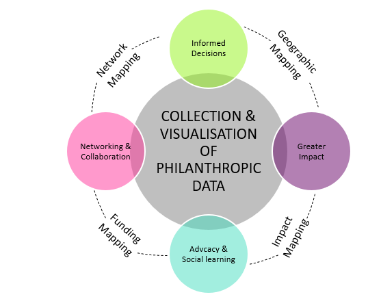
Figure 1: Visual mapping for advancing strategic philanthropy
| Learnings from Philanthropy Ireland’s integrated mapping exercise Philanthropy Ireland adopted an integrated approach to mapping geographic and funding data around philanthropic activities across 32 counties of Republic of Ireland and Northern Ireland for its Philanthropy in Ireland Map. One of the key learnings from this mapping exercise is that there is a strong need for standardisation in (I) reporting philanthropic data and (II) developing guidelines to measure impact. Philanthropic organisations often use different methods to report their giving, making it difficult to compare and aggregate data across different organisations and sectors. Therefore, developing reporting frameworks, establishing reporting requirements, and improving focus on impact can help develop an understanding of the landscape of philanthropy and support identifying trends and patterns in philanthropic giving over time. |
Collecting and visualising data around philanthropic efforts are the first steps towards advancing strategic philanthropy. Consistent, reliable data presented in a comprehensive manner and made easily accessible can inform action, demonstrate impact, improve social learning, support advocacy efforts and foster collaborations.
Authors